Workbench best practices
Tips & Tricks for making Fused Workbench work for you
Workbench is a web-IDE built to make working with Fused UDFs even faster!
Experimenting with UDFs, fast
In UDF Builder you have access to a Code Editor that runs your UDFs and outputs results directly on the Map View for you. As soon as you make changes they show up in Map View!
💡 Leverage all the UDF Best Practices
While this page is for Workbench, it builds on top of all the Best Practices that make your UDF fast & efficient. So if you haven't yet, take a look at our dedicated UDF Best Practices.
Use return to quickly explore data
Your UDF will stop at the first return it sees, which you can use to your advantage to return an intermediate result and explore it directly on the map:
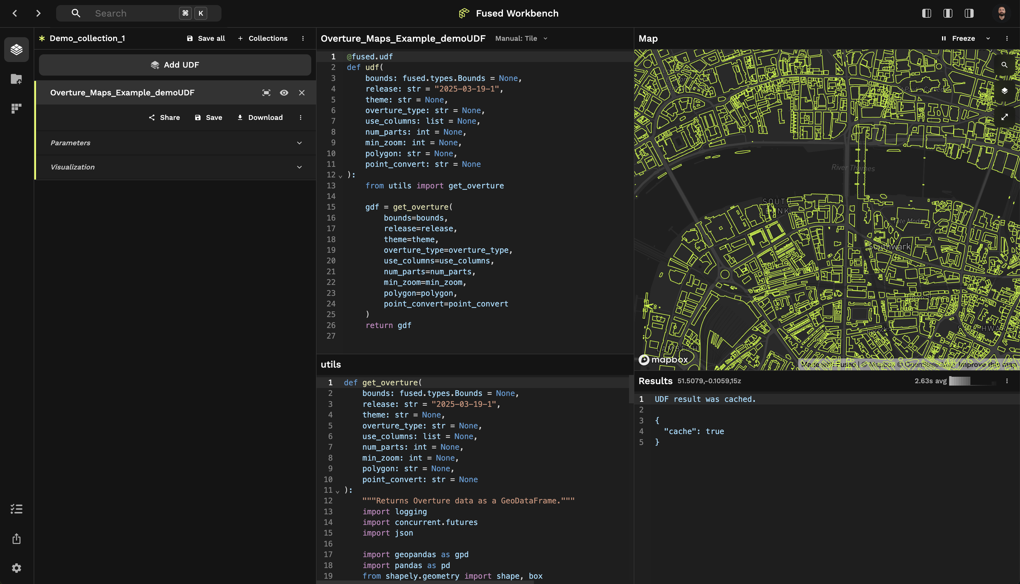
Example: Exploring bounds mid-UDF
In this example, we're using the Overture Maps Example UDF but not sure exactly what our bounds object looks like.
The easiest way to check is simply to return it inside our UDF before any other logic:
Use Workbench to explore data on top of Python
While you might be tempted to explore a specific row of a GeoDataFrame by filtering it and printing it, sometimes it faster to just click on it in Map View. Once selected, use the tooltip copy icon to copy the object as JSON, which you can then inspect elsewhere.
Format your code for more visibility
You can hit Opt + Shift + F (or Alt + Shift + F on Windows/Linux) to format your code with a smaller line-length. This comes in handy if you don't want to scroll left and right to read your code, at the expense of having a bit more up and down scrolling to do.
🗺️ Visualizing results
Changing map view
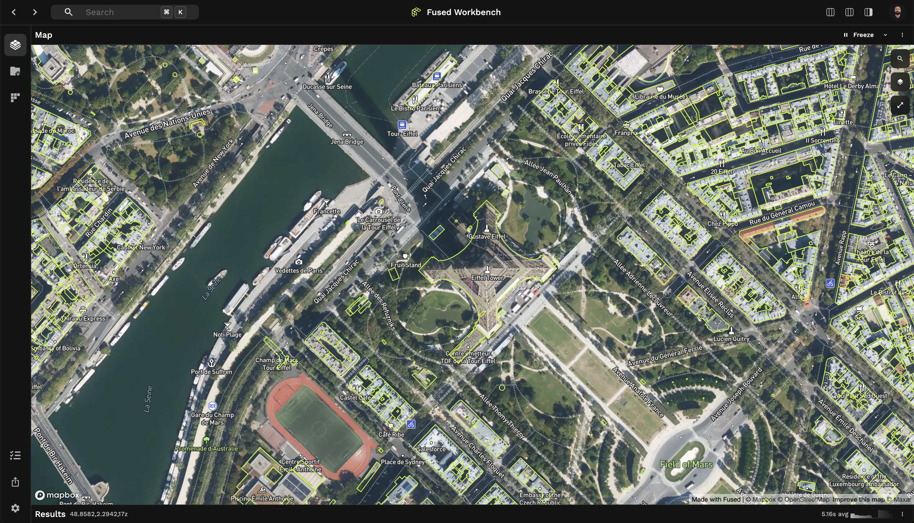
Map View supports multiple base maps that might be better suited for different uses cases.
- ⧉ Sometimes you just want a neutral basemap to focus on your data -> "Light" or "Dark" or even "Blank" basemaps are best
- 🌍 Other times you might want some context, in which case using the "Satellite" basemap will suit your need best
Using the Visualize Tab
You can easily change the styling of your data in the Visualization Tab:
- Changing the color of your data (especially for vector files)
- Using Visualize presets under "Preset"
- Creating your own custom
loadingLayer
Adjusting Opacity for Better Insights (Advanced Tips)
Opacity control is essential for analyzing layered or dense data:
- Detecting data density: Lower opacity (20-50%) helps identify areas where multiple points or features overlap, appearing as darker regions
- Visualizing through layers: Set opacity between 30-70% to see underlying basemaps or other data layers
- Highlighting confidence levels: Use opacity to represent confidence or importance of different features
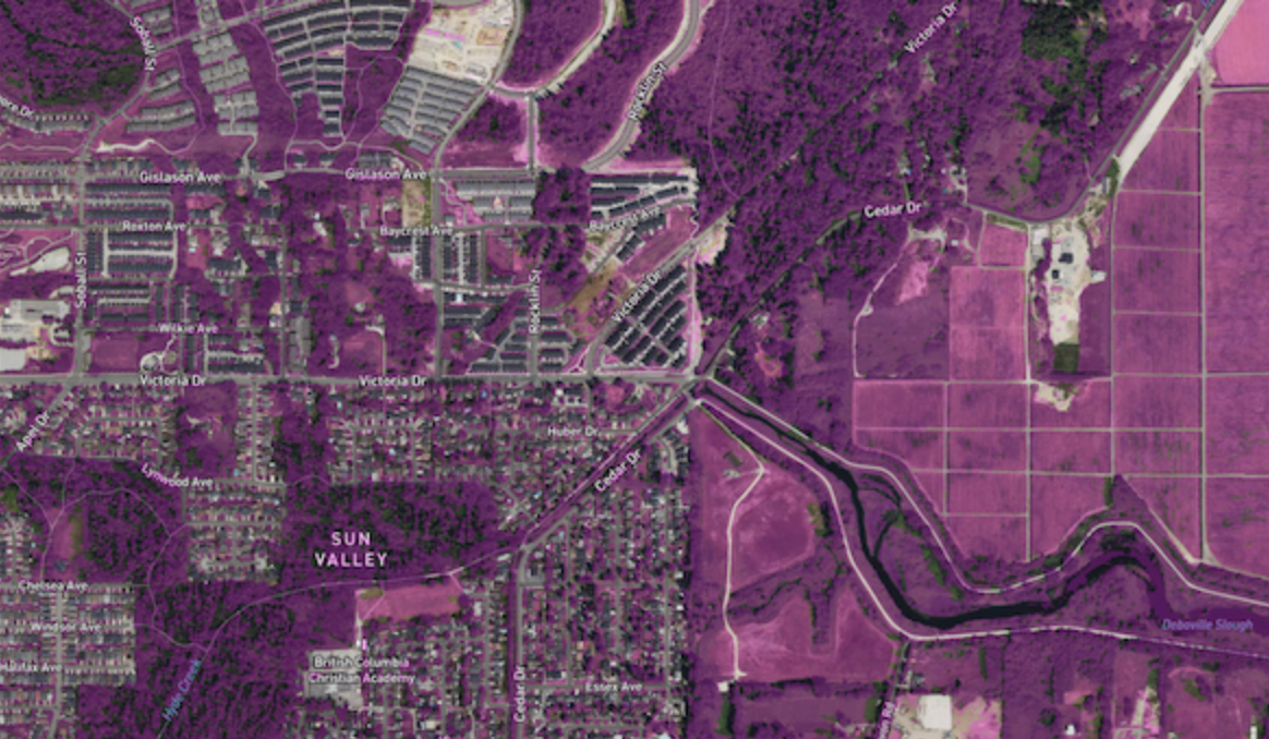
Example: Vegetation Segmentation with Semi-Transparent Overlay
The Vegetation Segmentation UDF demonstrates how reducing opacity helps visualize segmentation results while still seeing the underlying imagery:
"rasterLayer": {
  "@@type": "BitmapLayer",
  "opacity": 0.3,
  "pickable": true
}
This visualization uses:
- 30% opacity to show the vegetation segmentation results as a semi-transparent overlay
- The underlying satellite imagery remains visible for context
- The pickable property allows users to hover over areas to see detailed values
Detecting Feature Overlaps
Finding overlapping features is crucial for data validation and analysis:
- Fill vs. stroke emphasis: For overlap detection, use filled polygons with 40-60% opacity and thin strokes
- Contrasting colors: Use complementary colors when you need to distinguish overlapping features
- Using H3 hexagons: Convert irregular polygons to H3 hexagons for a regularized comparison
- Color-coding categories: Assign different colors to intersection vs. difference areas
Example: Advanced Overlap Analysis with H3 Hexagons
The Overture East Asian Buildings IOU UDF compares 2 datasets together. Here's the visualisation we used:
{
  "tileLayer": {
    "@@type": "TileLayer",
    "minZoom": 0,
    "maxZoom": 14,
    "tileSize": 256,
    "extrude": true,
    "pickable": true
  },
  "hexLayer": {
    "opacity": 0.5,
    "@@type": "H3HexagonLayer",
    "stroked": true,
    "filled": true,
    "pickable": true,
    "extruded": true,
    "getFillColor": {
      "@@function": "colorCategories",
      "attr": "how",
      "domain": [
        "intersection",
        "symmetric_difference"
      ],
      "colors": "TealRose"
    },
    "getHexagon": "@@=properties.hex",
    "getElevation": "@@=properties.ratio",
    "elevationScale": 50
  }
}
This visualization uses:
- H3 hexagons to normalize irregular polygon shapes
- Different colors to show where datasets overlap vs. differ
- Elevation to represent the overlap ratio
- 50% opacity to see through overlapping features

Visual Debugging Techniques
- Elevation as a debugging tool: Use 3D elevation (
extruded: true) to add an extra dimension to your analysis - Multi-dimensional visualization: Combine opacity, color, and height to encode different aspects of your data
- Color by data attributes: Map colors to categorical attributes and height to quantitative metrics
Optimizing Color Use for Analysis
- Color categories for types: Use distinct color schemes like
TealRoseto clearly distinguish between categories - Sequential colors for metrics: Use color gradients for representing continuous values like ratios or densities
- Diverging color schemes: Highlight values above and below an interesting mid-point in quantitative data - the middle color is assigned to the critical value with contrasting colors on either end
- Visibility first: Choose colors that maintain visibility over your basemap (darker colors for light basemaps, lighter colors for dark basemaps)
For a complete reference of available color schemes, check out CARTO color schemes which are implemented in DeckGL and available in Fused. These include categorical schemes like Bold and Pastel, sequential schemes like BluYl and Sunset, and diverging schemes like TealRose and Tropic.
Tilt Map view to explore 3D datasets
Map View gives you a top-level view of the world by default. But hold Cmd (or Ctrl on Windows / Mac) to tilt the view!
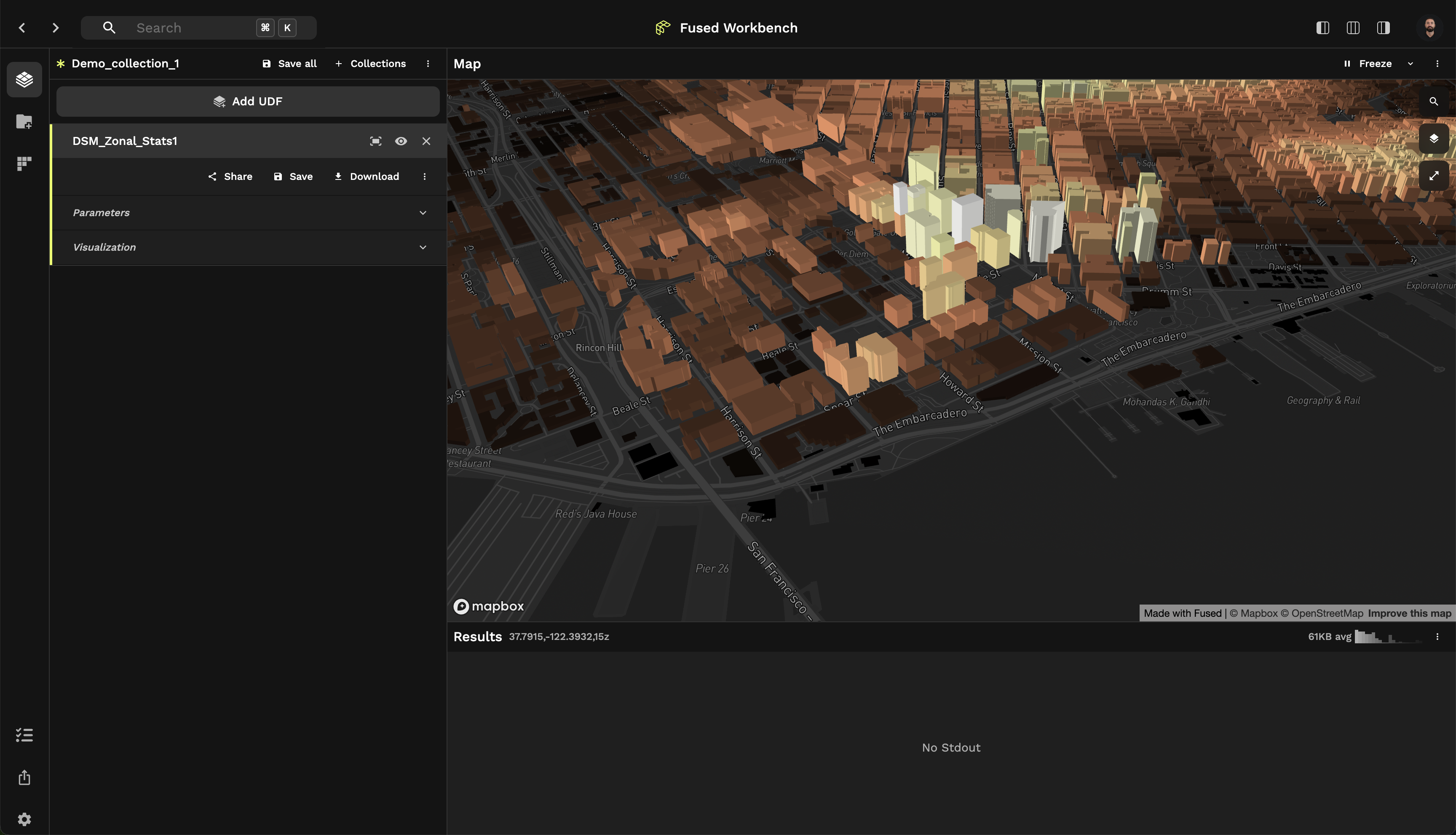
🏘️ This can be really helpful to explore 3D datasets like in this DSM Zonal Stats UDF.
You can reset the view by running the "Reset 3D view to top-down" shortcut from Command Palette
Navigating Workbench
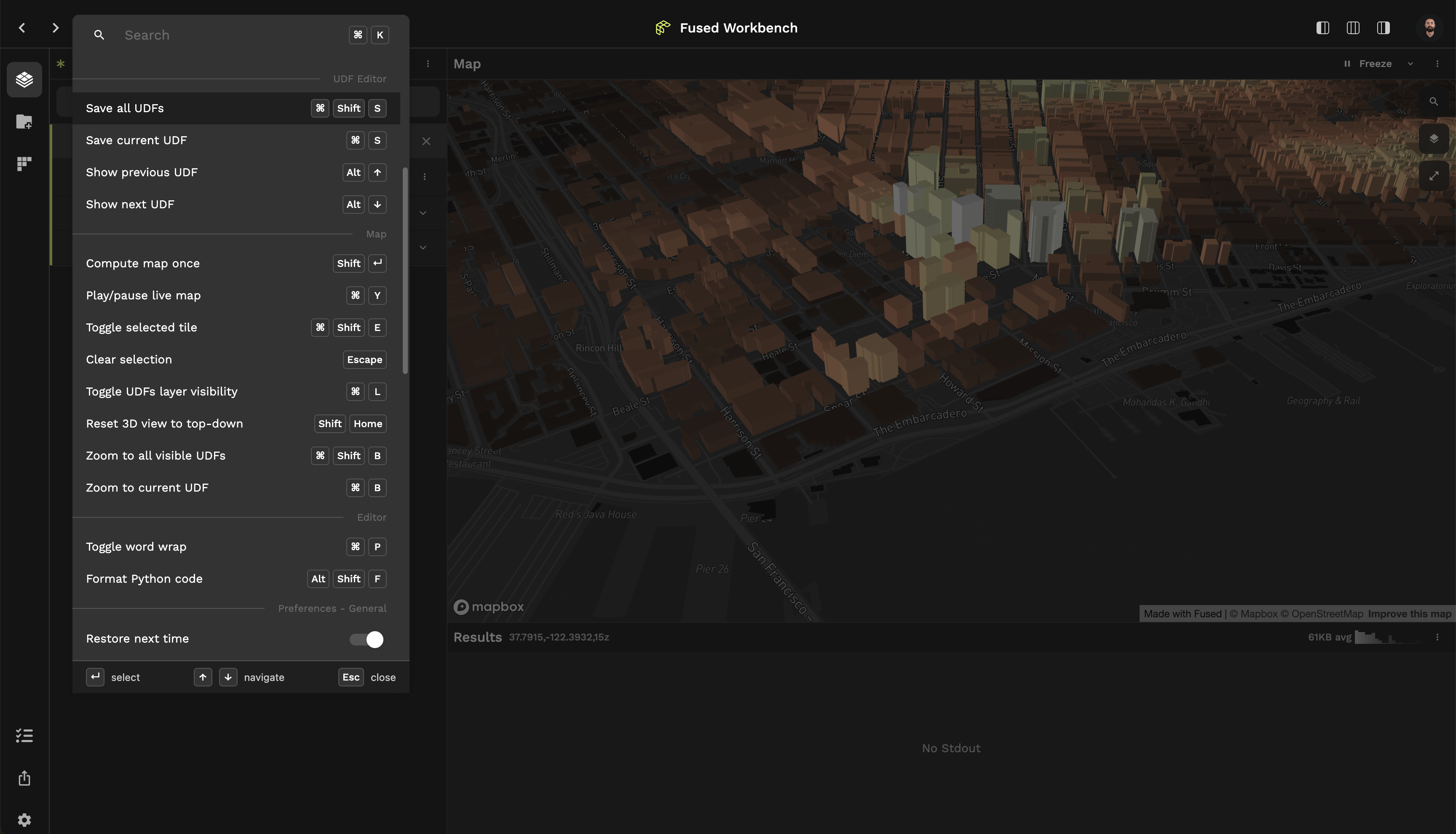
Using Keyboard Shortcuts: Command Palette
Workbench has built-in keyboard shortcuts & quick navigation features: Hit Cmd + K (or Ctrl + K on Windows / Linux) to bring up Command Palette or use the search bar in the header for quick access:
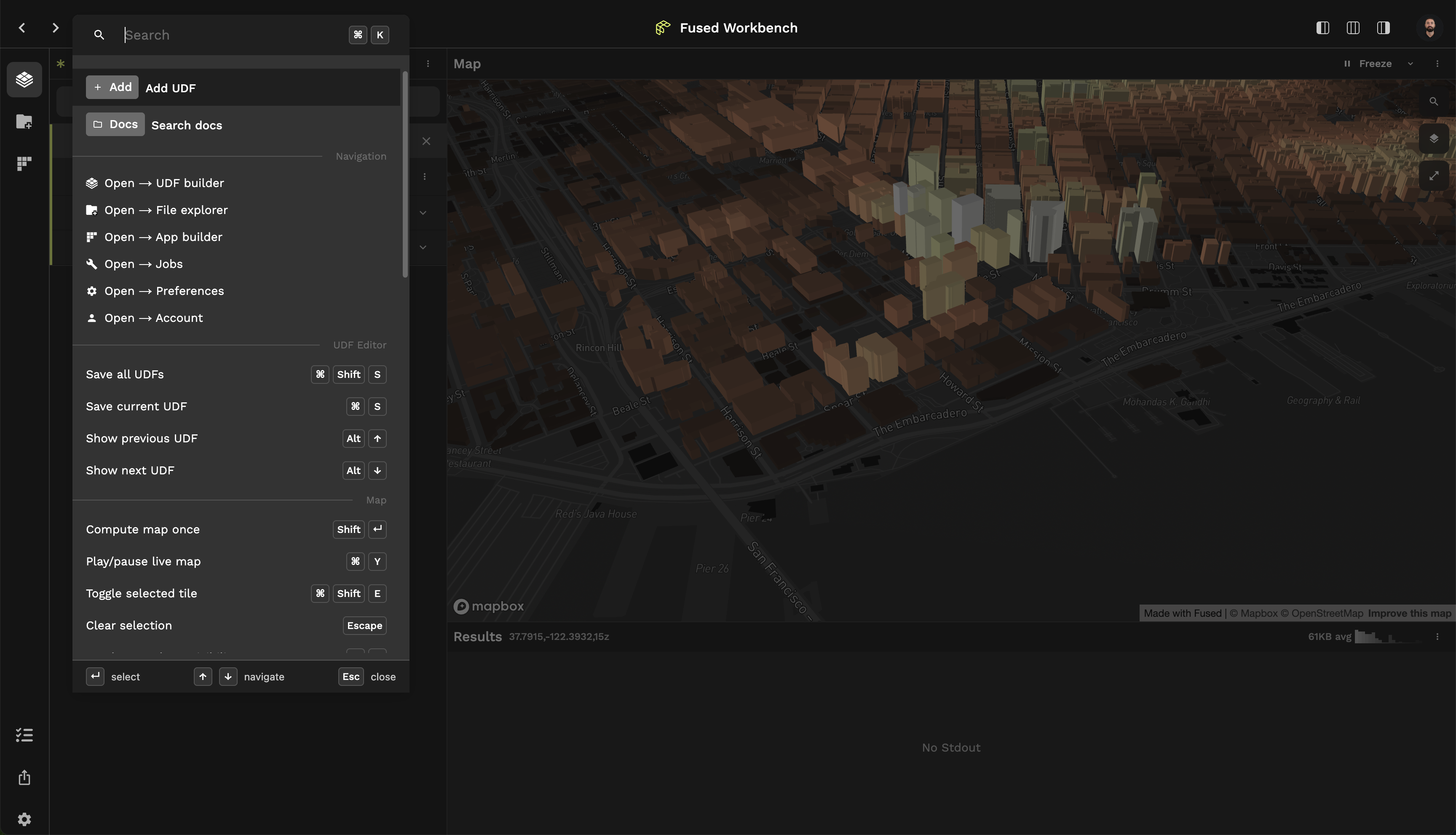
Without lifting your hands from the keyboard you can:
- Open a New UDF
- Search the Docs, directly in Workbench!
- See some of the most helpful Keyboard Shortcuts
You'll find a more extended list of Keyboard Shortcuts in the command palette.
Quickly jump from UDF Builder to File Explorer
UDF Builder & File Explorer work well together, so we've made easy to jump from one to the other
- In UDF Builder,
Cmd + Clickon as3://...path will open it directly in File Explorer - In File Explorer double clicking on a file will prompt Fused to do its best at guessing which Catalog UDF to use to load this file in Code Editor
Organising your work
Renaming UDFs
You can easily rename UDFs by clicking on the UDF name in the header and hitting Enter
Your team can load your own UDFs by calling it with a team udf name so be sure to give it an explicit name!
Using tags
You can add tags to your UDF in the Share page. This gives yet another way to find & search your UDFs. We recommend giving tags according to:
- Type of data the UDF works with (e.g.
satellite image,elevation model,population) - Type of analysis the UDF does (e.g.
zonal stats,building footprint extraction,flood mapping) - Type of file the UDF loads (e.g.
vector,raster,point cloud)
Using Collections
You can use Collections to organise your UDFs into different projects. This allows you to:
- Have multiple unrelated projects in Workbench
- Be able to share a set of UDFs at once with your team (by downloading a Collection & sending it to your team mates)
Troubleshooting
If things feel a bit off, for example your UDF output looks suspicious here are a few things you can do:
- Manually rerun the UDF with
Shift + Enter - Check how much RAM your tab is using (in Chrome can easily do so by hovering the tab). Sometimes too much data is brought in to your browser and while we do our best to manage it properly it can get out of hand. A good old tab refresh goes a long way