Best Practices
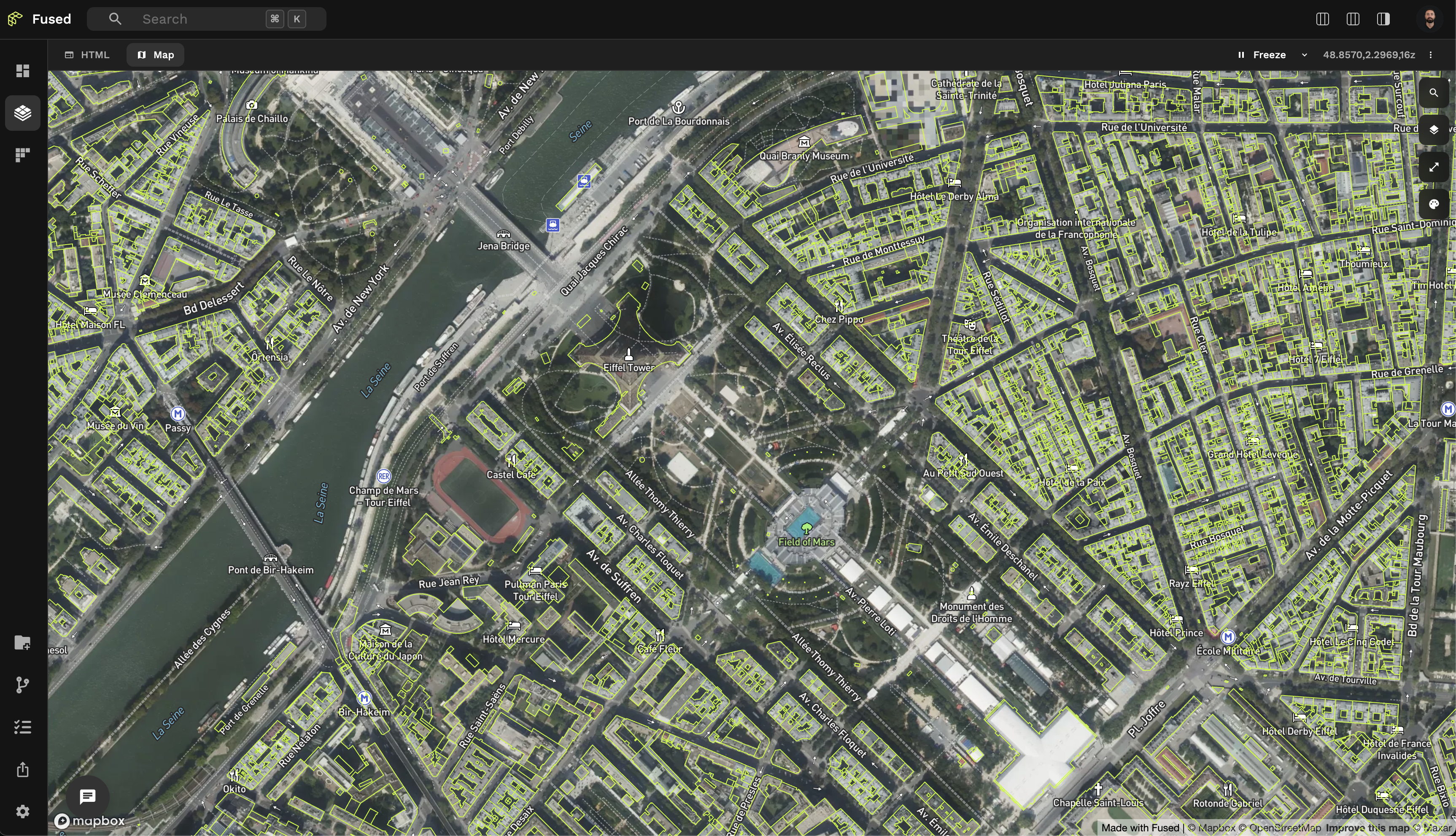
Explore data in "Map View"
While you might be tempted to explore a specific row of a GeoDataFrame by filtering it and printing it, sometimes it is faster to just click on it in Map View. Once selected, use the tooltip copy icon to copy the object as JSON, which you can then inspect elsewhere.
Changing map base layer
Map View supports multiple base maps that might be better suited for different uses cases.
- ⧉ Sometimes you just want a neutral basemap to focus on your data -> "Light" or "Dark" or even "Blank" basemaps are best
- 🌍 Other times you might want some context, in which case using the "Satellite" basemap will suit your need best
Using the Visualization
You can easily change the styling of your data in the Visualization:
- Changing the color of your data (especially for vector files)
- Using Visualize presets under "Preset"
- Creating your own custom
loadingLayer
Adjusting Opacity for Better Insights (Advanced Tips)
Opacity control is essential for analyzing layered or dense data:
- Detecting data density: Lower opacity (20-50%) helps identify areas where multiple points or features overlap, appearing as darker regions
- Visualizing through layers: Set opacity between 30-70% to see underlying basemaps or other data layers
- Highlighting confidence levels: Use opacity to represent confidence or importance of different features
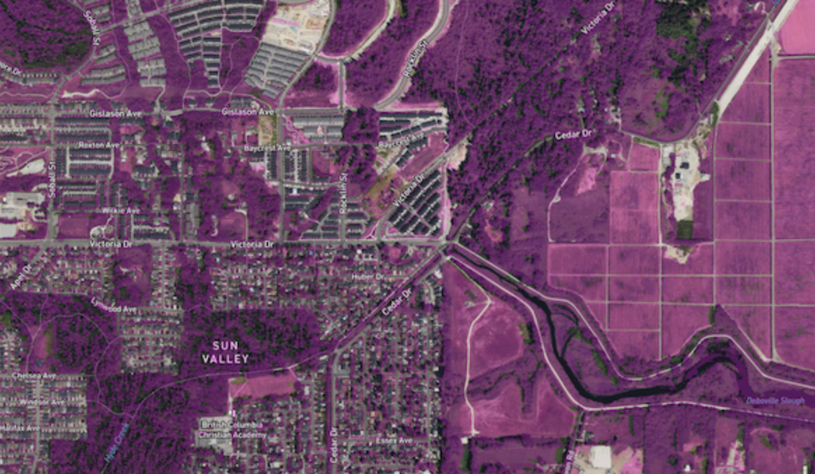
Example: Vegetation Segmentation with Semi-Transparent Overlay
The Vegetation Segmentation UDF demonstrates how reducing opacity helps visualize segmentation results while still seeing the underlying imagery:
"rasterLayer": {
  "@@type": "BitmapLayer",
  "opacity": 0.3,
  "pickable": true
}
This visualization uses:
- 30% opacity to show the vegetation segmentation results as a semi-transparent overlay
- The underlying satellite imagery remains visible for context
- The pickable property allows users to hover over areas to see detailed values
Detecting Feature Overlaps
Finding overlapping features is crucial for data validation and analysis:
- Fill vs. stroke emphasis: For overlap detection, use filled polygons with 40-60% opacity and thin strokes
- Contrasting colors: Use complementary colors when you need to distinguish overlapping features
- Using H3 hexagons: Convert irregular polygons to H3 hexagons for a regularized comparison
- Color-coding categories: Assign different colors to intersection vs. difference areas
Example: Advanced Overlap Analysis with H3 Hexagons
The Overture East Asian Buildings IOU UDF compares 2 datasets together. Here's the visualisation we used:
{
  "tileLayer": {
    "@@type": "TileLayer",
    "minZoom": 0,
    "maxZoom": 14,
    "tileSize": 256,
    "extrude": true,
    "pickable": true
  },
  "hexLayer": {
    "opacity": 0.5,
    "@@type": "H3HexagonLayer",
    "stroked": true,
    "filled": true,
    "pickable": true,
    "extruded": true,
    "getFillColor": {
      "@@function": "colorCategories",
      "attr": "how",
      "domain": [
        "intersection",
        "symmetric_difference"
      ],
      "colors": "TealRose"
    },
    "getHexagon": "@@=properties.hex",
    "getElevation": "@@=properties.ratio",
    "elevationScale": 50
  }
}
This visualization uses:
- H3 hexagons to normalize irregular polygon shapes
- Different colors to show where datasets overlap vs. differ
- Elevation to represent the overlap ratio
- 50% opacity to see through overlapping features

Tilt Map view to explore 3D datasets
Map View gives you a top-level view of the world by default. But hold Cmd (or Ctrl on Windows / Mac) to tilt the view!
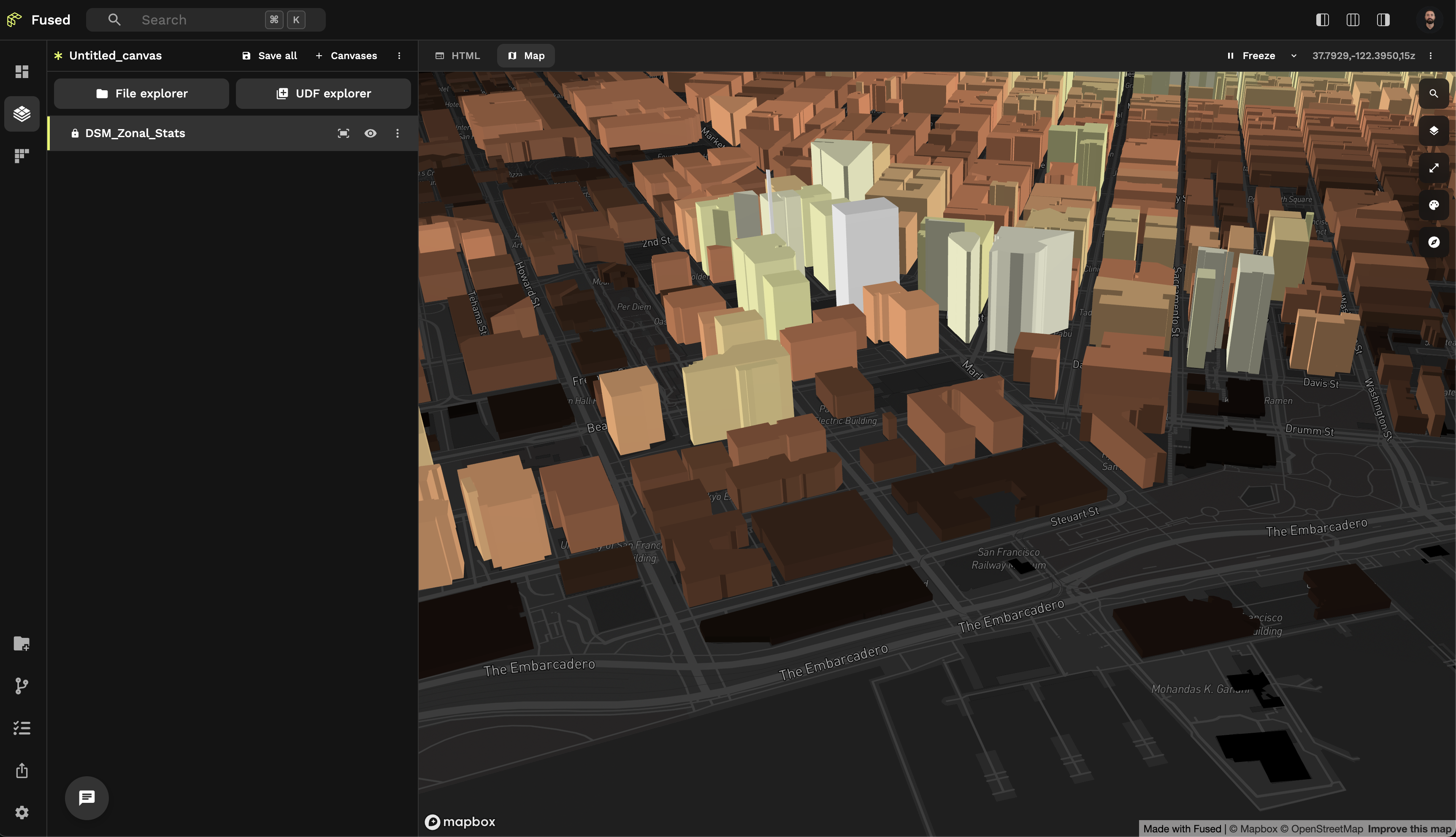
🏘️ This can be really helpful to explore 3D datasets like in this DSM Zonal Stats UDF.
You can reset the view by running the "Reset 3D view to top-down" shortcut from Command Palette