The Strength in Weak Data Part 3: Prepping the Model Dataset
TL;DR Kristin shares a UDF to create training data for a corn yield prediction model using Zonal Statistics.
Hello friends, thanks for following my journey so far. To catch you up, I'm trying to solve the problem of farmers and traders relying on weak and untimely predictions of corn yield. Weak because they are at the national level and untimely because the predictions come once a month.
So here's the deal: farmers and traders have been relying on national-level corn yield predictions that are not only weak but also painfully slow, arriving just once a month. Imagine making critical decisions based on a single data point each month.
Not ideal, right? That's exactly the issue we're tackling in this blog post series.
Let's say you are a corn trader and it's halfway through the month, a major flood devastates key corn-growing areas. If you only get yield estimates monthly, you won't know until it's too late—prices will have already spiked, and you've missed your chance to act. But with updates twice a month or more, you'd catch the disaster early, adjust your trades, and stay ahead of the market. In a $21 billion corn commodities market, better, faster insights can make all the difference. Advanced geospatial modeling can bring those efficiencies, turning weak data into powerful decisions.
Motivations
Let's find some efficiencies using advanced geospatial modeling and the latest research.
I previously showed how Solar Induced Flourescence (SIF) is a direct measurement of photosynthesis and therefore a better indicator of crop yield than NVDI indices.
But there's a catch—this data is weak because it's at a 25 km² resolution, which any geospatial machine learning scientist would find, well, less than ideal. To make matters worse, our actual yield data (our target variable) is at the county level. Double yikes!
But fear not. This problem can be solved!
Thanks to the scaling capabilities for geospatial modeling in Fused I am able to solve this data by increasing the amount of data and therefore the statistical power of it.
Diving into the Data Details
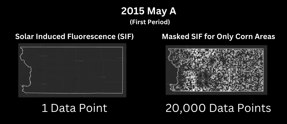
Remember from the previous post how we transformed one data point per county into 20,000 by taking only SIF measurements for corn? Let's visualize that for the first collection in May (we get two collections per month -a and b):

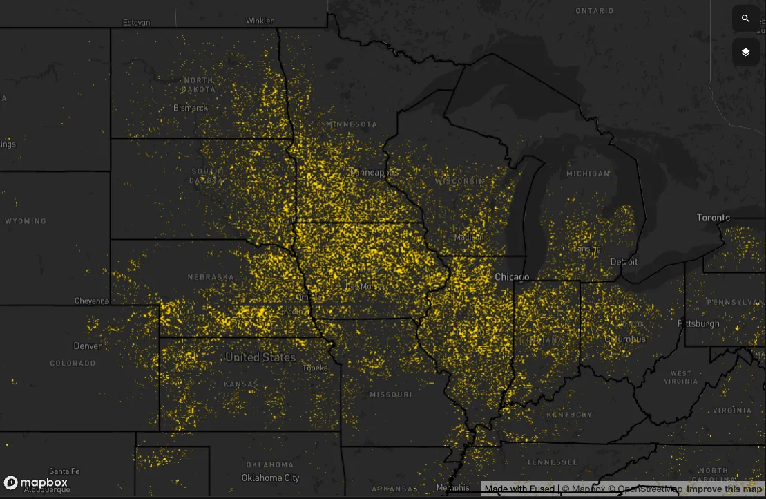
Now, suppose we want to do this where corn is grown in the midwest US. Here is what the states that grew corn in 2018:

Within these states, we have 1,333 counties. Assuming each is similar in size to my home county of Lyon County, we can calculate:
1,333 counties × 20,000 data points = 26 million data points
That's 20,000 times the statistical power! 🎉
Let me say that louder for the people in the back: 26,000,000 vs. 1,333 data points
And that's just for one time period. If we run a model on 2–4 time periods, we're looking at nearly 100 million data points. Now, building a model on 100 million data points isn't trivial, but at Fused, this process becomes a breeze.
Building the Training Dataset
I'm aiming to predict corn yield based on my SIF readings from early May, late May, early June, and late June. So, we need to build out a table with this structure:
| County | Year | Yield (bushels per acre) | Area of Corn (acres) | Area of County (acres) | SIF Value-201605a (early May) | SIF Value-201605a (late May) |
|---|---|---|---|---|---|---|
| 17015 | 2016 | 205 | 124,145 | 3,032,0383 | .15 | .65 |
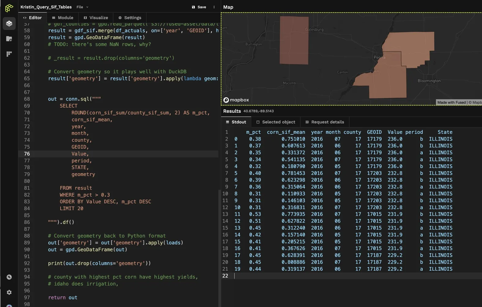
To quickly validate this table against a map, I'll build out my workflow in Fused using Python and query the table with SQL. In the past, working with these two languages would have required complex tooling, storing data in a warehouse, and roughly five hours to run. With Fused, I can simply reference the a GeoDataFrame object and query in SQL with DuckDB all within the same UDF—taking just five seconds!
Here's what it looks like:

Splitting the Data
But we're not stopping there! To ensure our model is both robust and unbiased, we need to carefully split our data. Enter Walk-Forward Cross-Validation — a game-changer for time series data. Think of it like planting seeds each season and harvesting them before the next planting. By always training on past data and testing on future data, we respect the natural flow of time. This method is perfect for corn yields because, just like how last year's harvest influences this year's, our model benefits from understanding those temporal dependencies. Plus, it prevents any sneaky data leakage, ensuring our predictions are based solely on what's known up to that point.
Conclusion and Next Steps
Keep going or end here?
By progressively expanding our training set, each fold builds on the last, capturing more nuanced patterns and trends. To bring this to life, I'm leveraging TimeSeriesSplit from sklearn, seamlessly integrating it into our workflow. This tool simplifies the process, allowing us to focus on what truly matters—unlocking the full potential of our 100 million data points for actionable predictions.
And there you have it! We've taken weak, infrequent data and transformed it into a powerhouse dataset ready to drive smarter decisions in the $21 billion corn commodities market. Stay tuned for the next part of our journey, where we'll dive into building and fine-tuning our predictive models. Until then, keep cultivating those insights! 🌽
