The Strength in Weak Data Part 2: Zonal Statistics

TL;DR Kristin created a UDF to mask cropland areas using USDA data and run a Zonal Statistics workflow for corn yield predictions.
A raster, a vector, and an array walk into a bar…
Ok I will spare you the corny jokes.
But seriously, I was facing a problem with these three data types when I approached Fused. It felt impossible to join this information together in a meaningful way. Fortunately, I was quickly proven wrong with the power of UDFs. Let me catch you up.
In Part 1, we explored county-level corn yield data and used Solar Induced Fluorescence (SIF) as our predictor. Now, we're unlocking how to strengthen weak data by merging multiple spatial data sources.
In this blog post, I'll show how I created a UDF to implement a Zonal Statistics analysis by County on a Corn Yields raster.
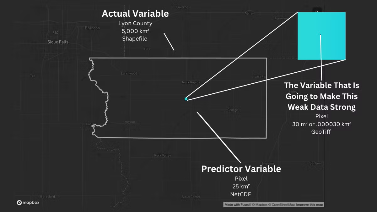
The variable that makes this weak data strong
We're dealing with county-level data as the actual variable and a 25 km² pixel as the predictor variable—definitely poor resolution in the world of Earth Observation data. Ideally, we want something closer to a 30m square or less. Luckily, I found exactly what I needed in Fused: a UDF with the resolution to sharpen our insights.
Let me take you to the county where I grew up:
Farming isn't static—corn fields rotate with soybeans or cover crops yearly, adding noise to our data. Here's a 25 km² area:
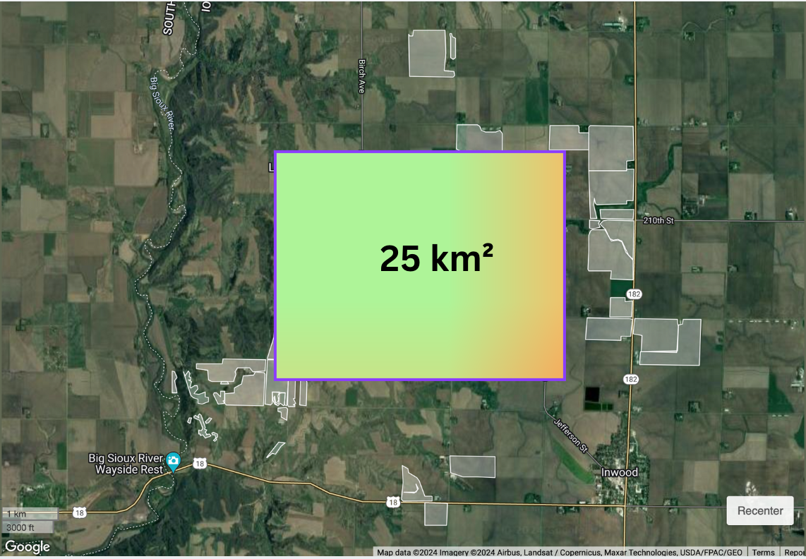
This block includes not only farmland but also trees, towns, and water bodies. Our challenge is to isolate the specific areas where corn is grown to enhance the precision of our analysis. Enter Fused, which has a Public CDLs UDF that reads the USDA Cropland Data Layer, letting me specify the year and crop type to pinpoint corn accurately.
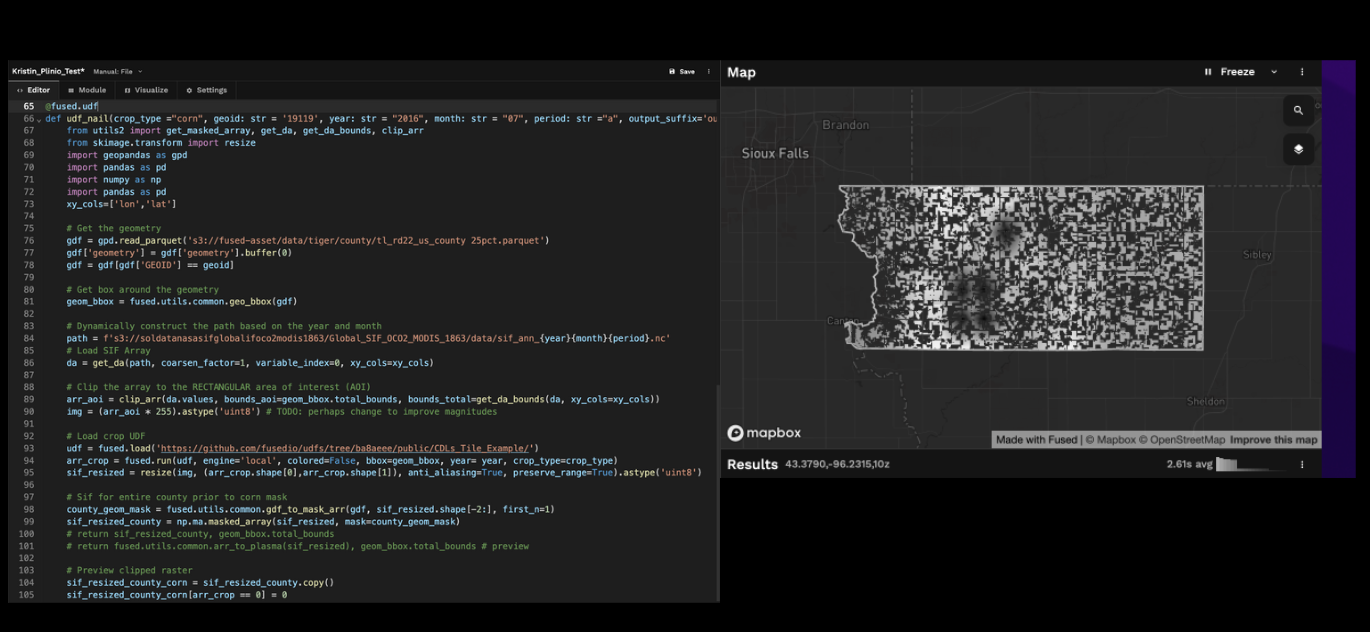
Masking crop areas with a UDF
To tackle this, I created a Fused UDF that loads the USDA Cropland Data Layer for a specified year and crop type to identify corn-growing regions. I then used corn-growing regions to mask a Solar Induced Fluorescence raster. Finally, I calculate its mean values for each county.
Now for the fun part:
- SIF Data: Display SIF for a specific month from a NetCDF file.
- Corn Areas: Map corn cultivation that year from a GeoTIFF file of the Cropland Data Layer (CDL) data product.
- Precision Clipping: Clip layers to show SIF values only where corn grows.
- Zonal Statistics: Aggregate the SIF that incides on corn crops for each county.
You can see the UDF code here and even clone it to your Fused workspace.
Voila! From one county's weak data to creating summary statistics for the county. This provides the ingredients to boost the prediction strength and reduce noise in the prediction model I want to build.
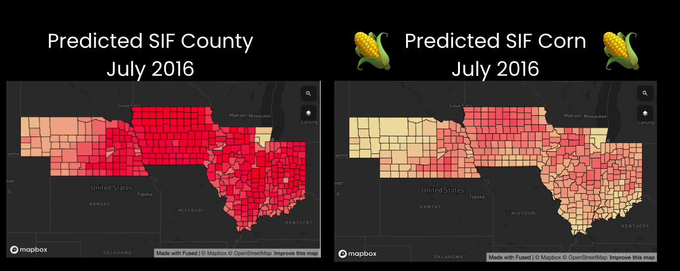
Scaling Up
Applying this to 400 Midwest counties transforms our dataset from 400 points to 60 million. The results?
- Enhanced statistical power: More data = stronger, more reliable predictions.
- Improved accuracy: Predictions are more closely aligned with actual outcomes.
Here is how the data compares on a map.
Why It's simple with Fused
With Fused, working with rasters and vectors is straightforward. This blog post showed how I'm turning weak, unreliable data into a powerhouse of insights effortlessly.
Ready to transform?
Curious to see the magic? Interact with the UDF in the Fused Map Builder and elevate your data from weak to strong. Harness your data's full potential and make impactful decisions!
Feel free to reach out if you have any questions at info@fused.io.