The Strength in Weak Data Part 1: Navigating the NetCDF

TL;DR Fused streamlined Kristin's workflow to integrate CSV and NetCDF data directly from S3.
Ever tried to make sense of the myriad file types in spatial data science and felt like you've wandered into a linguistic labyrinth? Trust me, you're not alone. As a data scientist who's spent more time wrangling datasets than I care to admit, I thought I'd take a casual stroll down memory lane with an old high school friend: regression models. Just a simple plot of actual vs. predicted, right? But when spatial data's involved, you can't just sit back and relax—you've got to keep one eye on the geometries.
I'm currently working on an agricultural project, and growing up on a farm gives me a personal stake in this. This blog illustrates my solution to the geometry debacle. I'll first take you to the area where I grew up: Lyon County.
The Geometry Challenge: A Look at Lyon County
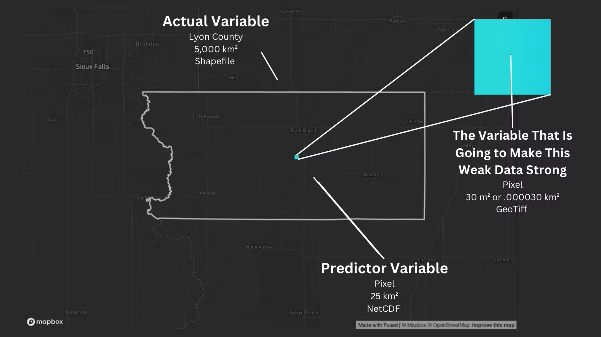
The resolution differences are huge—going from 30 square meters up to 5 billion! Traditional tools would have you pulling your hair out, but Fused lets you turn this "weak" data into something powerful.
Actual Variable: Handling the Data Mismatch
When dealing with data that doesn't quite match up—like trying to combine different resolutions—you need to align everything to the coarsest resolution. In this case, that's the county level.
Here's how I tackled it: I grabbed a CSV file of county ANSI codes along with my actual variable data. Using Fused's Fused's File Explorer, I plotted the data easily. Just a quick visit to the File Explorer S3 bucket, a double-click on the file, and the entire map rendered instantly.
Remember the days of wrestling with shapefile resolutions? No more. I edited the UDF to pull my actual data CSV straight from my S3 bucket in under 30 seconds. Boom.
Predictor Variable: Navigating the NetCDF
Now, let's get into the predictor variable—a NetCDF file from 5 degrees off the equator, covering around 25 square kilometers. NetCDF files can be a bit tricky to work with due to their complex formats, but Fused's utility modules make it easier. I imported some key functions directly into my UDF to clip the array, convert it into an image, and add a colormap.
@fused.udf
def udf(bbox: fused.types.TileGDF=None, path: str='s3://fused-asset/misc/kristin/sif_ann_201508b.nc'):
    xy_cols=['lon','lat']
    utils = fused.load("https://github.com/fusedio/udfs/tree/057a273/public/common/").utils
    # Get the data array using the constructed path
    da = utils.get_da(path, coarsen_factor=3, variable_index=0, xy_cols=xy_cols)
    # Clip the array based on the bounding box
    arr_aoi = utils.clip_arr(da.values,
                       bounds_aoi=bbox.total_bounds,
                       bounds_total=utils.get_da_bounds(da, xy_cols=xy_cols))
    # Convert the array to an image with the specified colormap
    img = (arr_aoi*255).astype('uint8')
    return utils.arr_to_plasma(arr_aoi, min_max=(0, 1), colormap="rainbow", include_opacity=False, reverse=True)
Once I saved the UDF and created an HTTPS endpoint, I visualized the data interactively in the App Builder.
The Variable That is Going to Make this Weak Data Strong
Okay, I have prepped my actual and predictor variables. Now, I will focus on how to fuse the geometries together using the variable that is going to make this Weak Data Strong (30 square meters). For that, stay tuned for Part 2, where I'll dive into the techniques for aligning and merging these spatial layers into a cohesive analysis. See you in the next installment!